
A History of Bob Dylan Concert Posters in Six Parts
Part 1: The 1960s
Flagging Down the Double E’s is an email newsletter exploring Bob Dylan concerts throughout history. Some installments are free, some are for paid subscribers only. Sign up here:
Today we kick off a six-part series exploring the history of Bob Dylan concert posters. There will be one entry per decade, and each will consist of two sections:
A look at the “standard” posters of the era. The ones that were used show after show, for an entire tour.
My favorite custom one-offs. Particularly cool posters created just for one specific show that were never seen again. This “bonus” part will be for paid subscribers only.
We start today with the 1960s. All images via the essential resource DylanStubs.
Disclaimer: I’m using the term “poster” a little loosely. “Printed concert advertising material” is more accurate, but makes for a cumbersome headline. Working off digital images of these decades later, it can sometimes be difficult to determine whether these were posters hung up on walls, flyers handed out, or even ads in magazines or newspapers. Where I do know, I’ll say.
The Standard Tour Posters
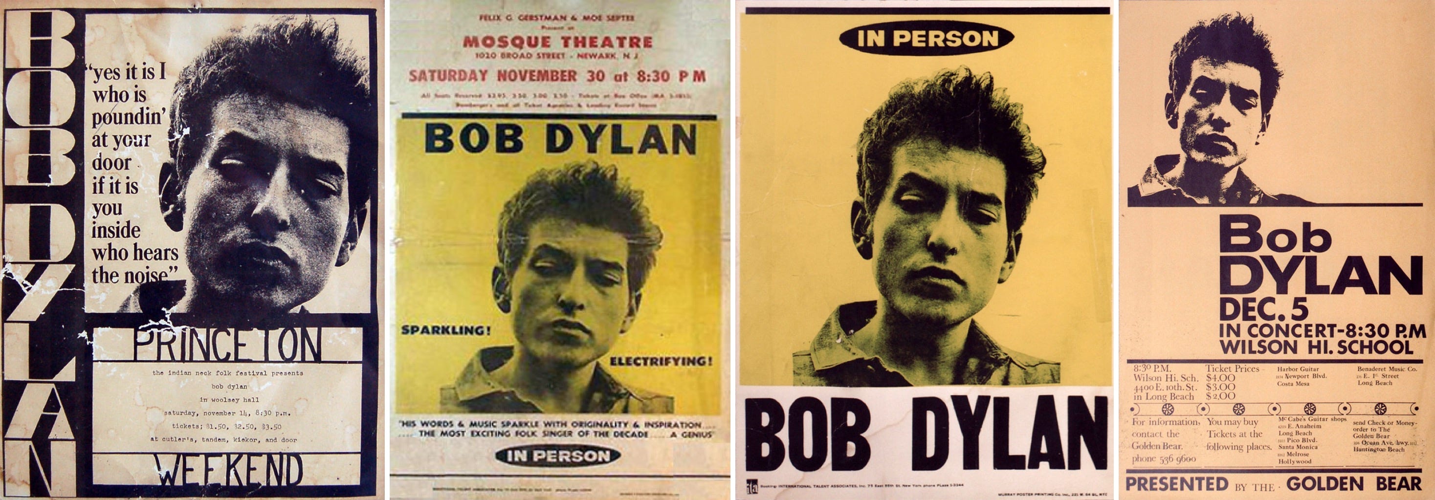
In the first couple years of the ’60s, Bob Dylan didn’t tour in the same way—maybe a gig out of town here or there, but not weeks or months on the road—so he didn’t really have “standard” concert posters. They were all fairly bespoke for a specific show or festival (where he was lucky if they spelled his name right). We’ll see some of those very-early-’60s posters in the second section.
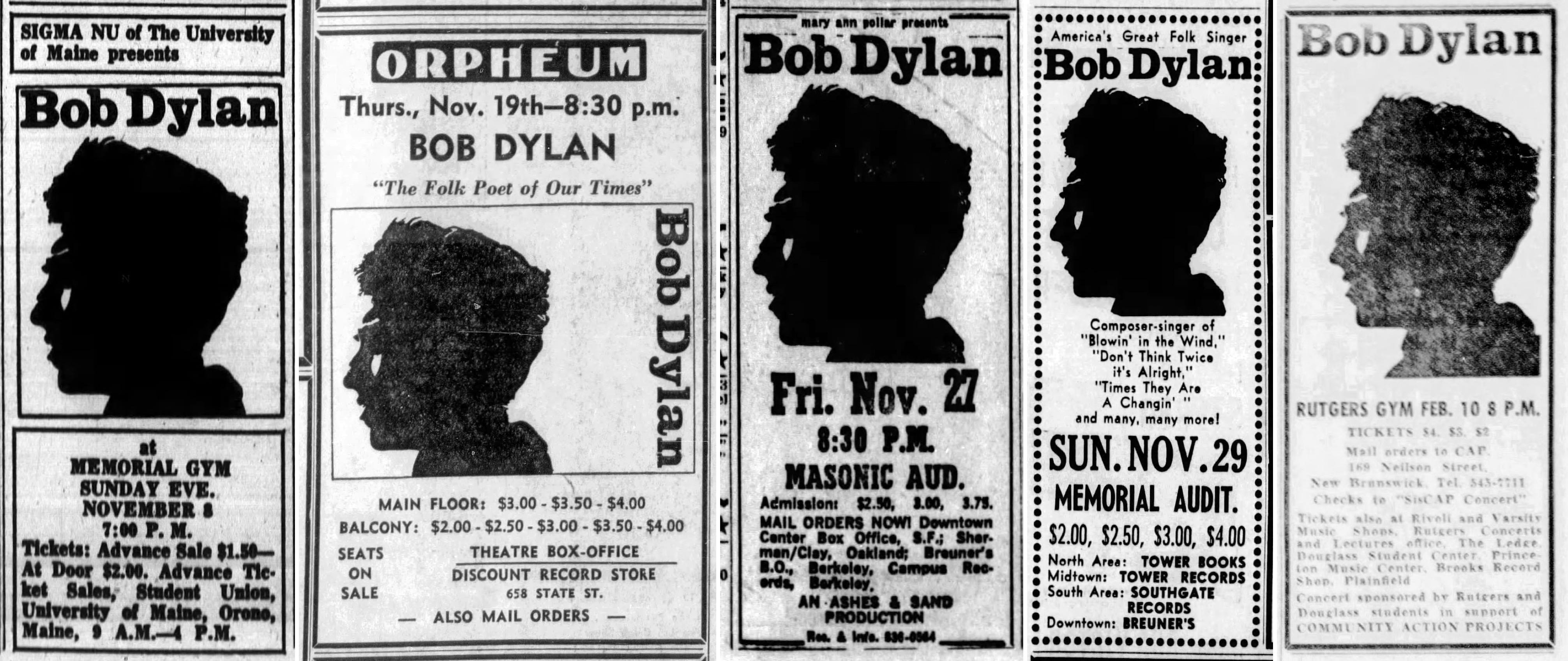
By 1963, that began to change. He began “touring” more, or at least playing more shows outside the Village coffeehouse scene that would require posters. Plus as a Columbia recording artist with first one then two albums under his belt, he now had the industry backing to create standardized promo materials. Similar designs and photos begin popping up again and again. Like these two versions, same lettering but different photos, one for vertical and one for horizontal:
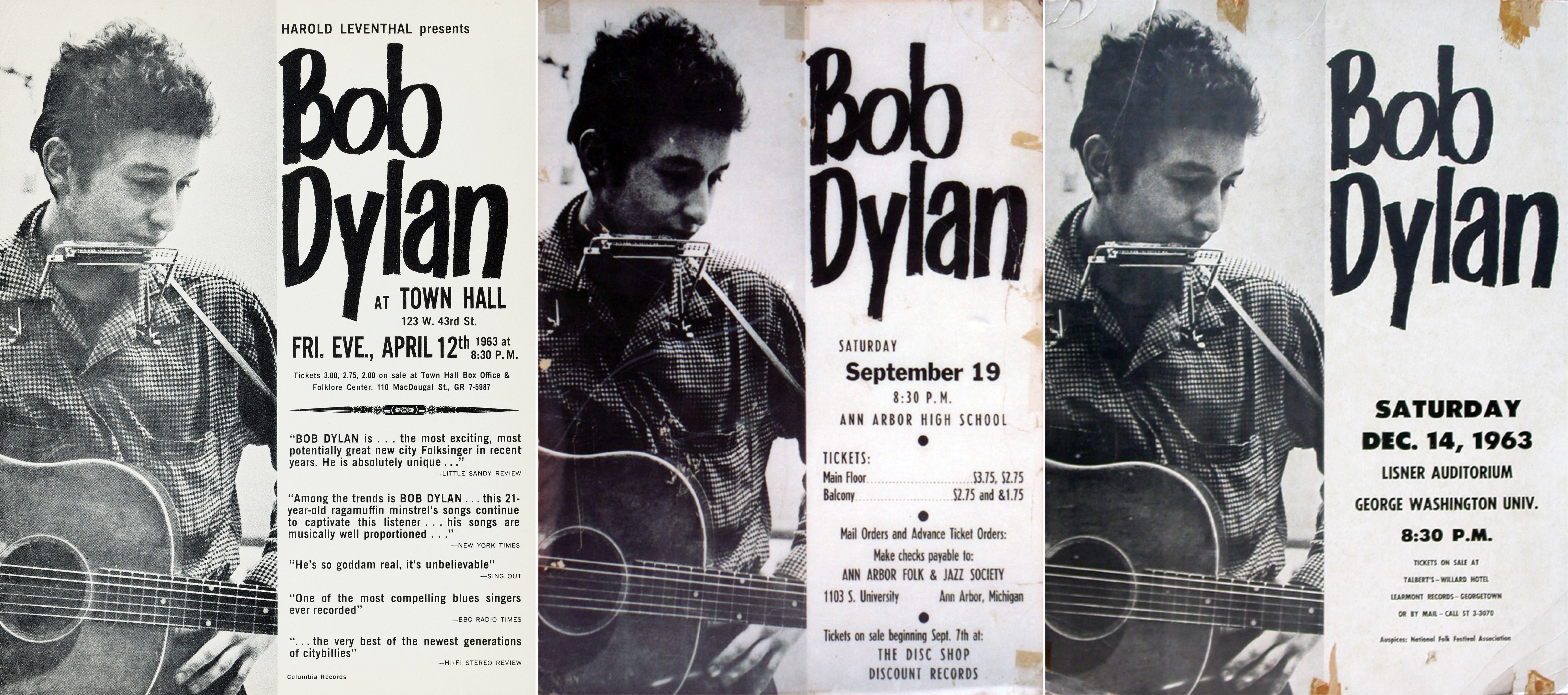
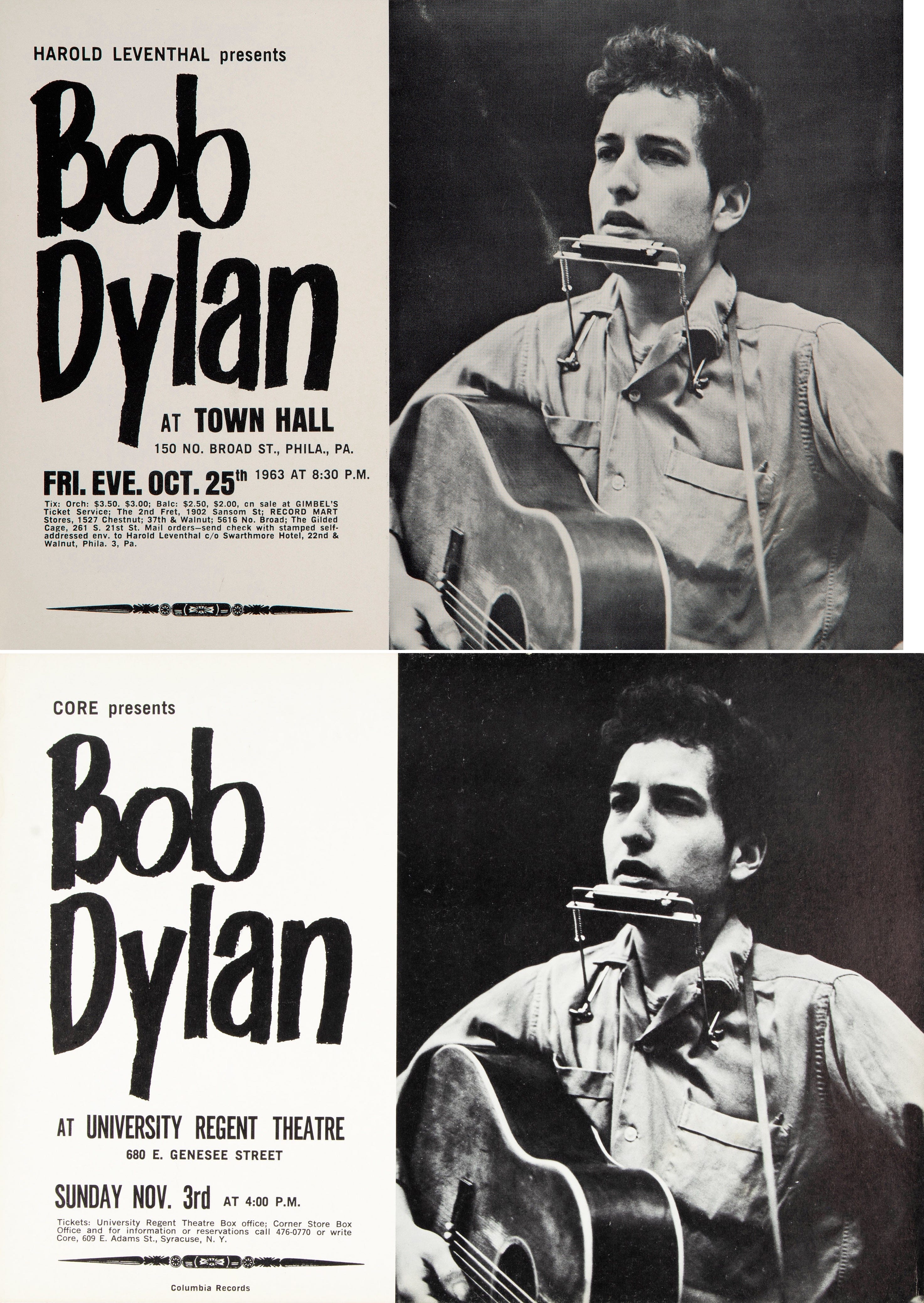
The Times They Are a-Changin’ cover photo also pops up a lot in ’63-’64, but in different contexts. I’m guessing the photo was given to local promoters as a publicity still and they could use it however. Not quite a “standard” poster design like the ones above, but not totally random either.
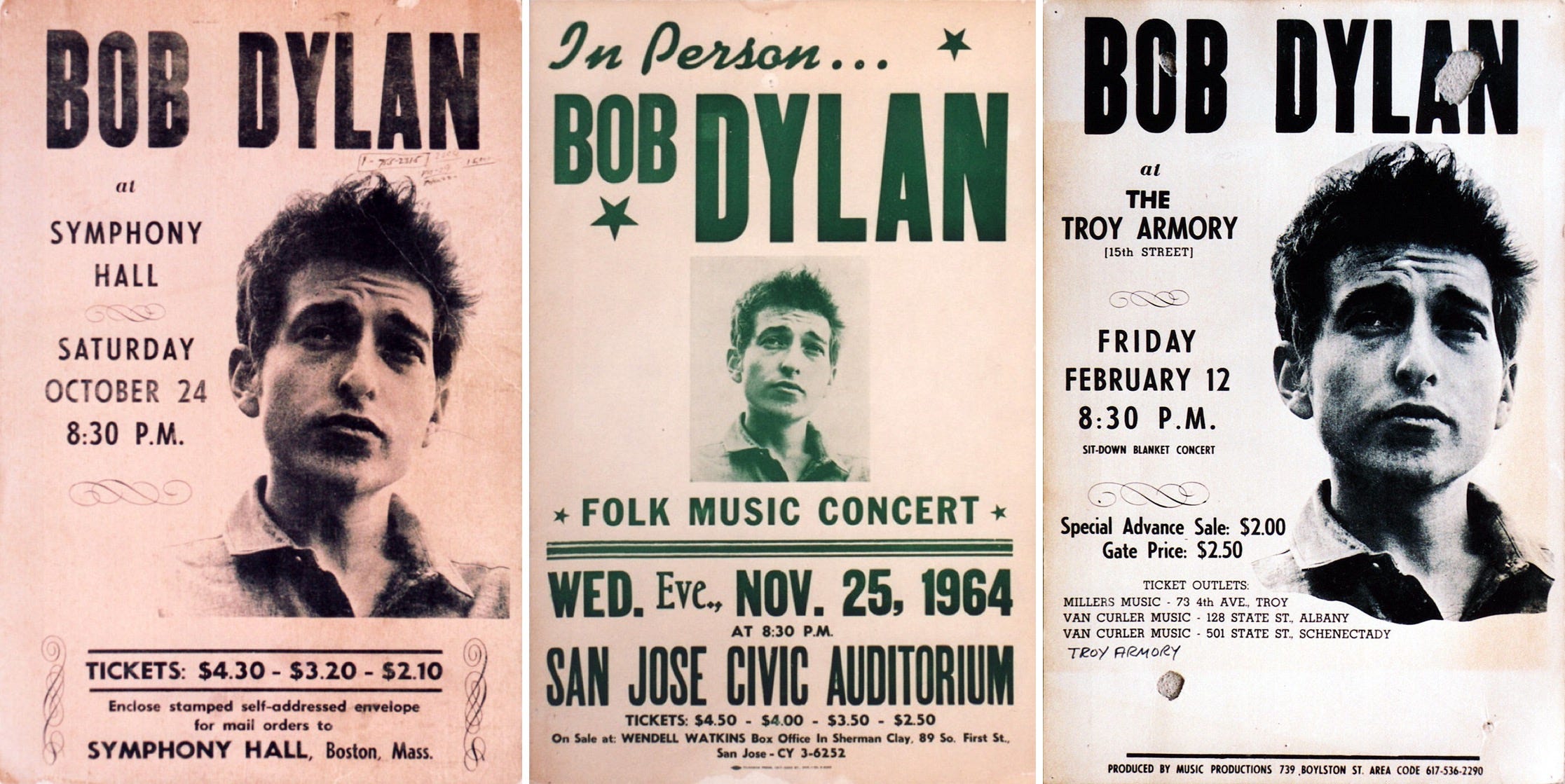
They also used this slightly different photo from the same shoot, where he’s looking up instead of down, on a bunch of posters from ’64 into ’65. And the lettering is more similar. They’re still all a bit different, but there’s more standardization here.
Interestingly, newspaper ads for the same shows all used a different photo, a dark silhouette I’ve never seen on a poster. One photo given to the poster people; another given to the ad people.
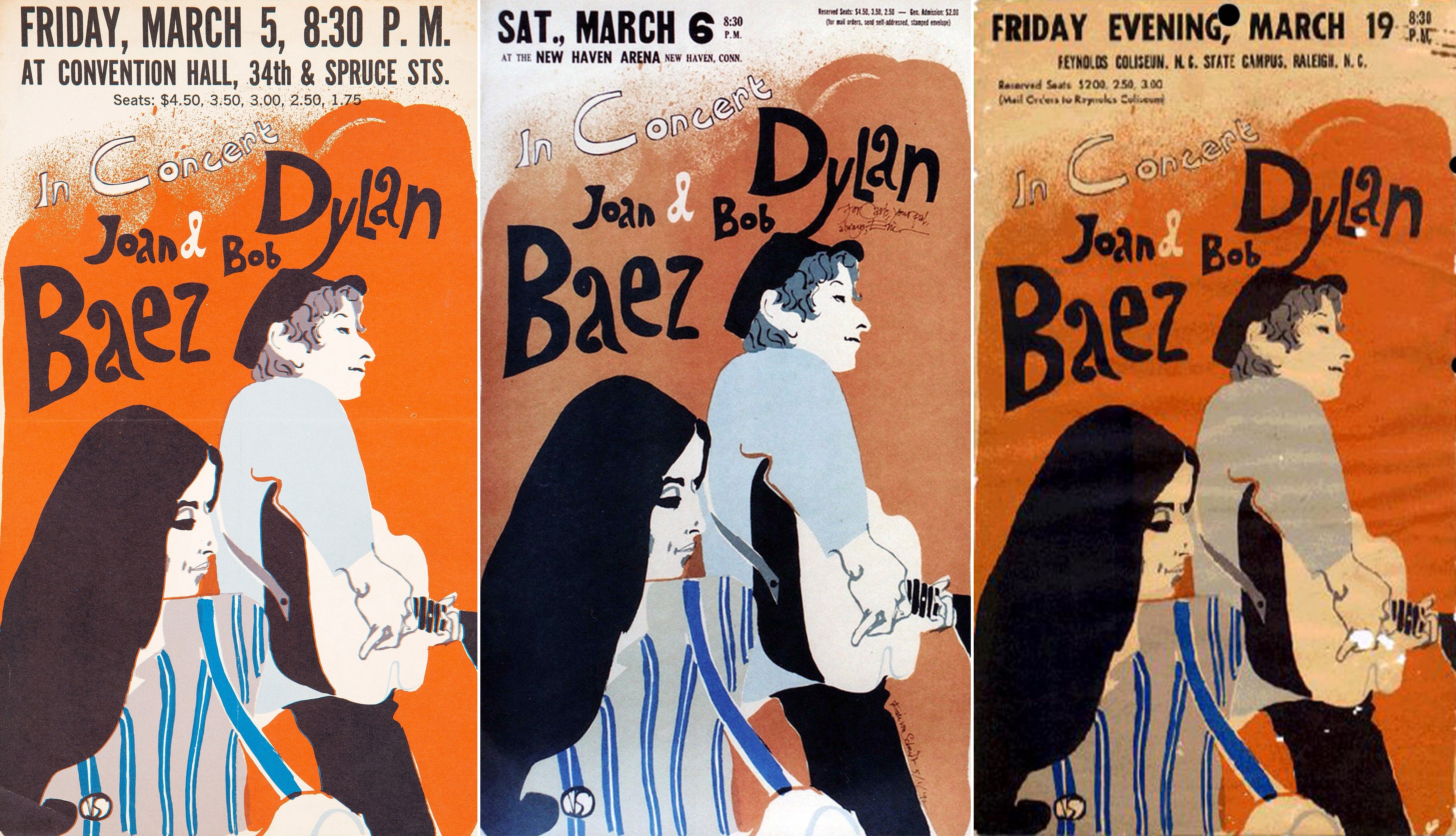
In March 1965, Dylan embarked on a co-headlining tour with Joan Baez. At this point, the posters are again getting fully standardized, and from here on out they basically stay that way. It’s the same concept of poster design you still see today. Essentially: Here’s the tour image with whatever text applies to the whole tour, but they leave some white space at the top or bottom for the promoter or venue to insert the information pertaining to the specific show. That will become the norm going forward.
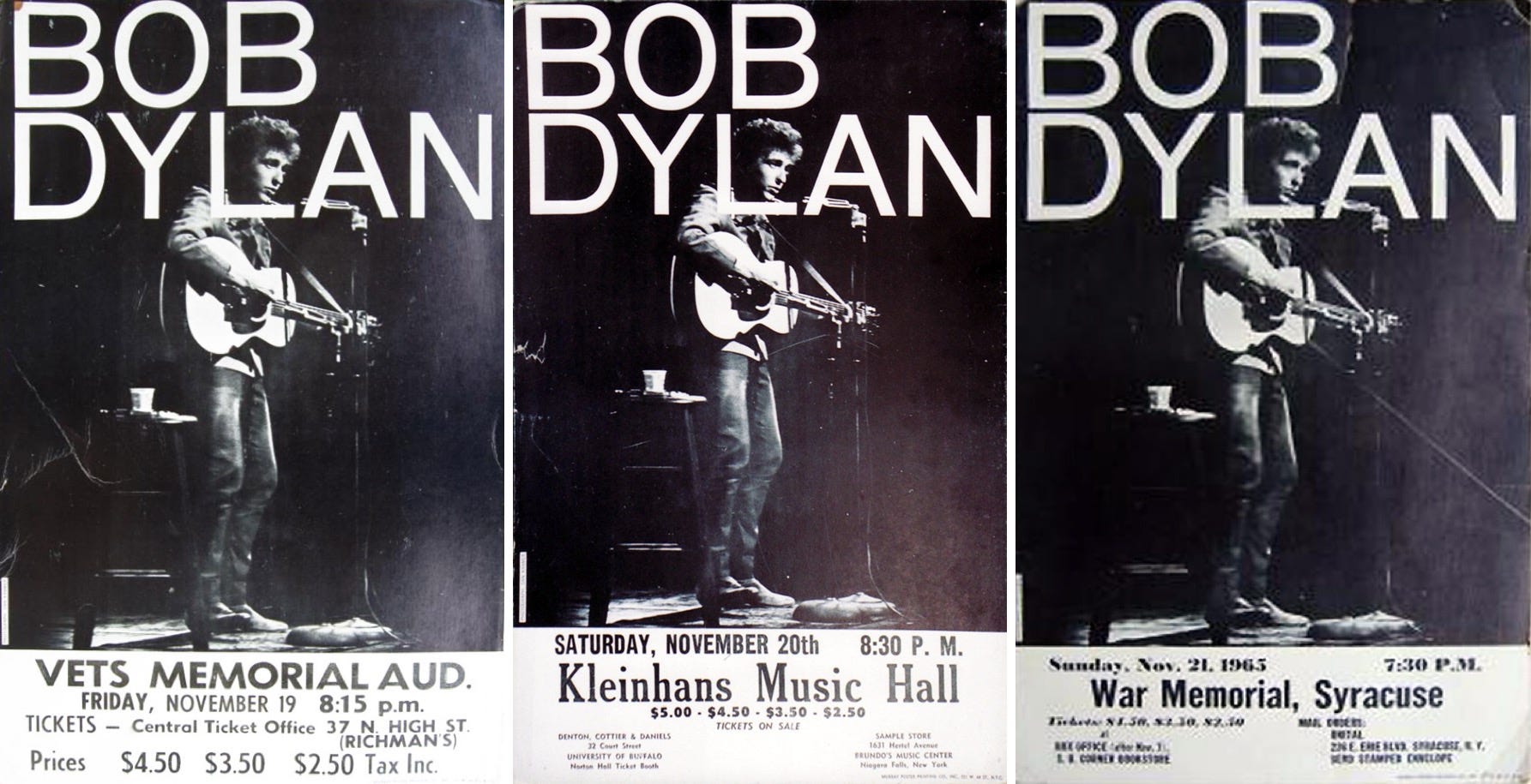
Six months later, in the fall of 1965, Dylan’s first electric tour hilariously featured a prominent image of him playing an acoustic guitar. No wonder people were so surprised when The Hawks started ripping in the second half! After the Newport drama, were the promoters trying to assuage the buying public? “Don’t worry, we promise the show will look like this at least part of the time.”
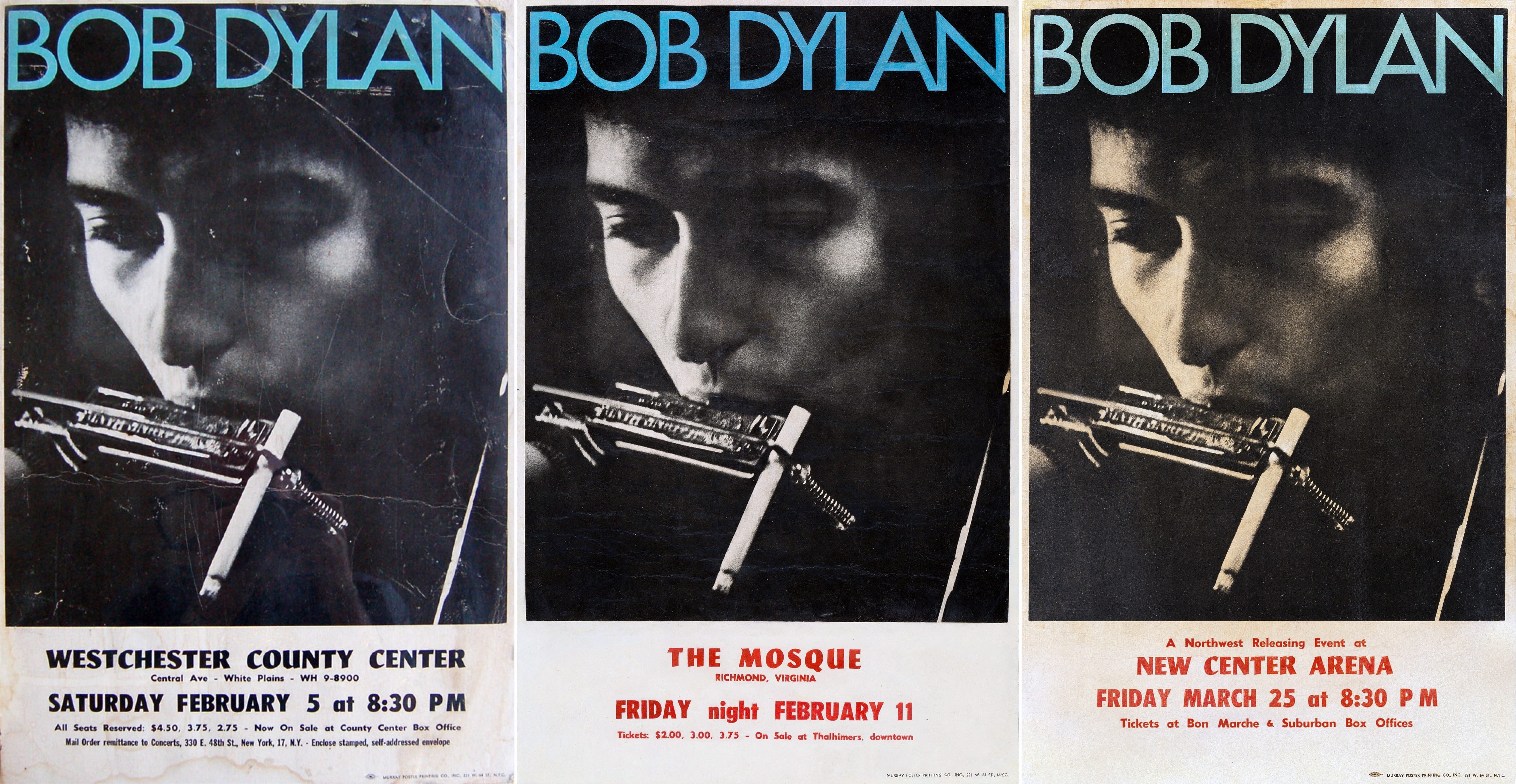
When the Hawks tour resumed in early 1966 (that’s the lesser-known US portion, before it got to Australia and Europe), there was a different standard image. An excellent photo, too, with the cigarette poking out of the harmonica holder.
Surprisingly, when the tour continued overseas—all the most famous 1966 shows, in other words—the posters begin to dry up. There are plenty of newspaper ads, from Australia especially, but few posters. Not enough to say really what the “standard” poster was, if there even was one then (I’ll share a few one-offs below). This auction writeup for a blank poster indicates they were back to using that acoustic-guitar template again for the UK dates, but, if they actually used it, it’s strange I can’t find a single image with a show date on it. Likely Dylan could sell tickets in the UK and Europe easily enough without the promoter needing to spend money on printing up posters.
Custom One-Night-Only Posters
At the end of each decade, I’ll share some of my favorite one-offs: Posters that do not seem to have been part of a series, but created by an individual venue/promoter/artist for one night only. (Spoiler alert: These are often the coolest ones.)
Keep reading with a 7-day free trial
Subscribe to Flagging Down the Double E's to keep reading this post and get 7 days of free access to the full post archives.